Starting Point
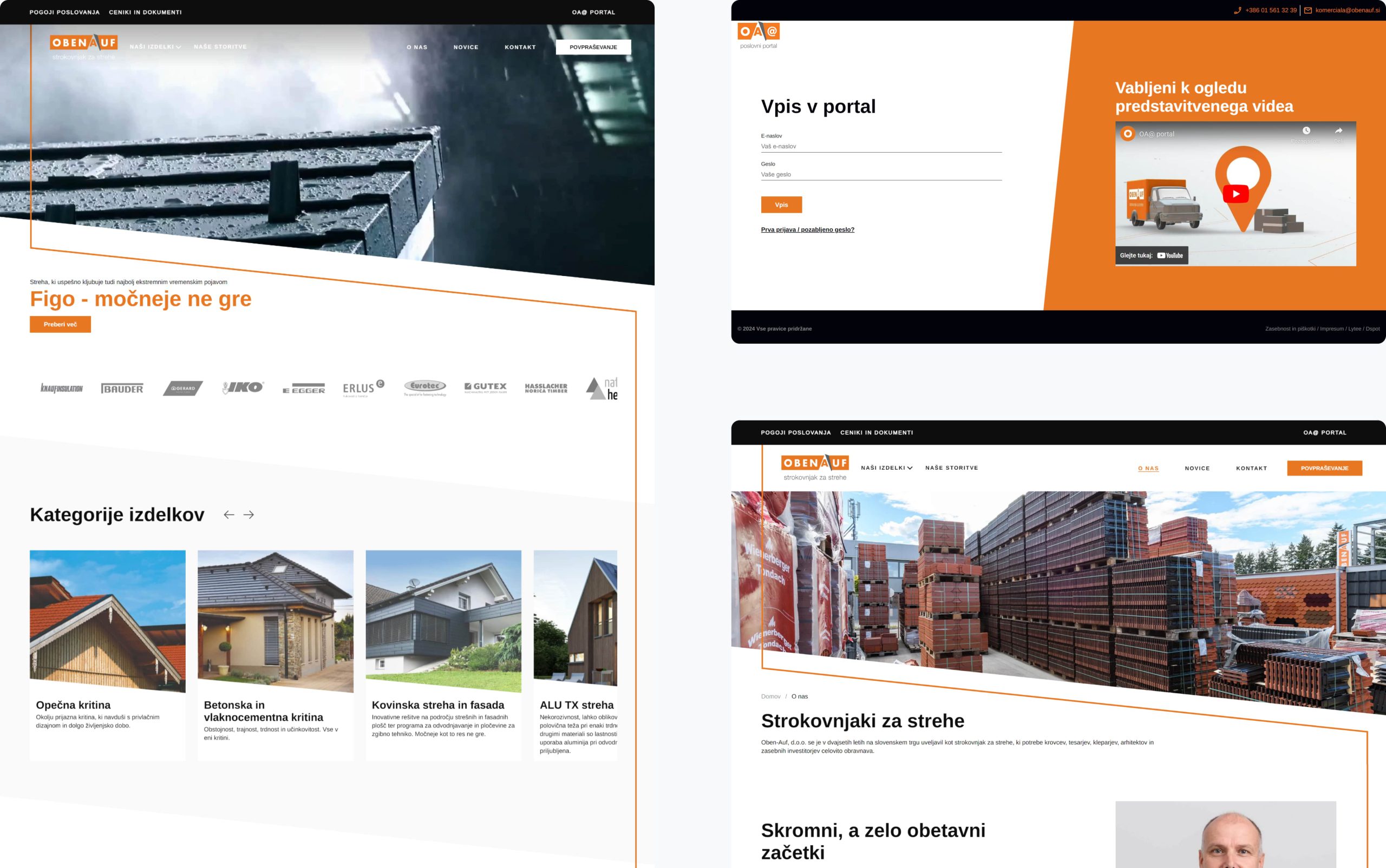
As the number of business partners grew, the client wanted to upgrade the website in two ways – the main site would function as a digital catalogue of the entire range of products, and at the same time establish a B2B portal for their business partners.
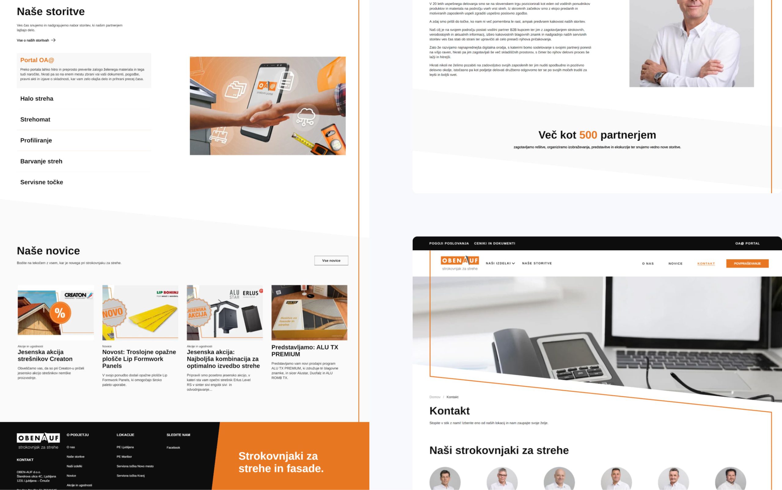
The portal would greatly ease the filed work, as they could now order materials, check and track orders anywhere, anytime and generally manage pending matters easily.
The overall redesign of the website and the layout of the portal had to be in line with the existing graphic design guidelines and have a good user experience, reflecting the client's values and business practices. The competing examples were significantly outdated, both technologically and in terms of user experience - the main drawback, for example, was the lack of responsive display on different devices.
Design Process
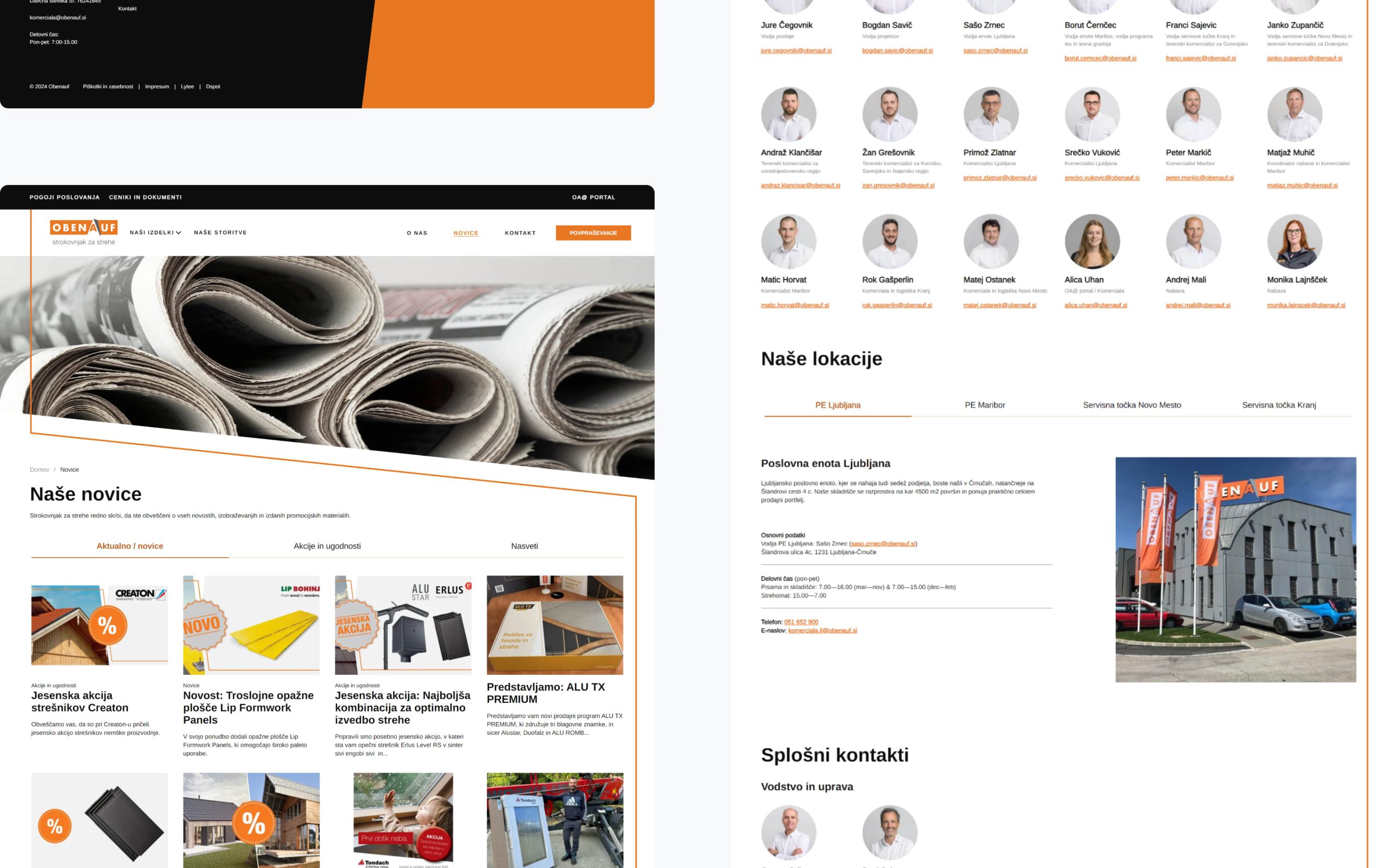
During the meetings I got to know the client's activities, product range and their users. In the end we came to the conclusion that regular visitors should be provided with key information, such as contact details, enquiries, etc., and new visitors should be invited to explore the site and get in touch. Using user scenarios and several iterations of wireframes, I came up with a basic prototype, which was then adapted further, according to the actual data, until we achieved our goals - one of which is to personalise the offer in the business portal according to the needs and preferences of the customer.
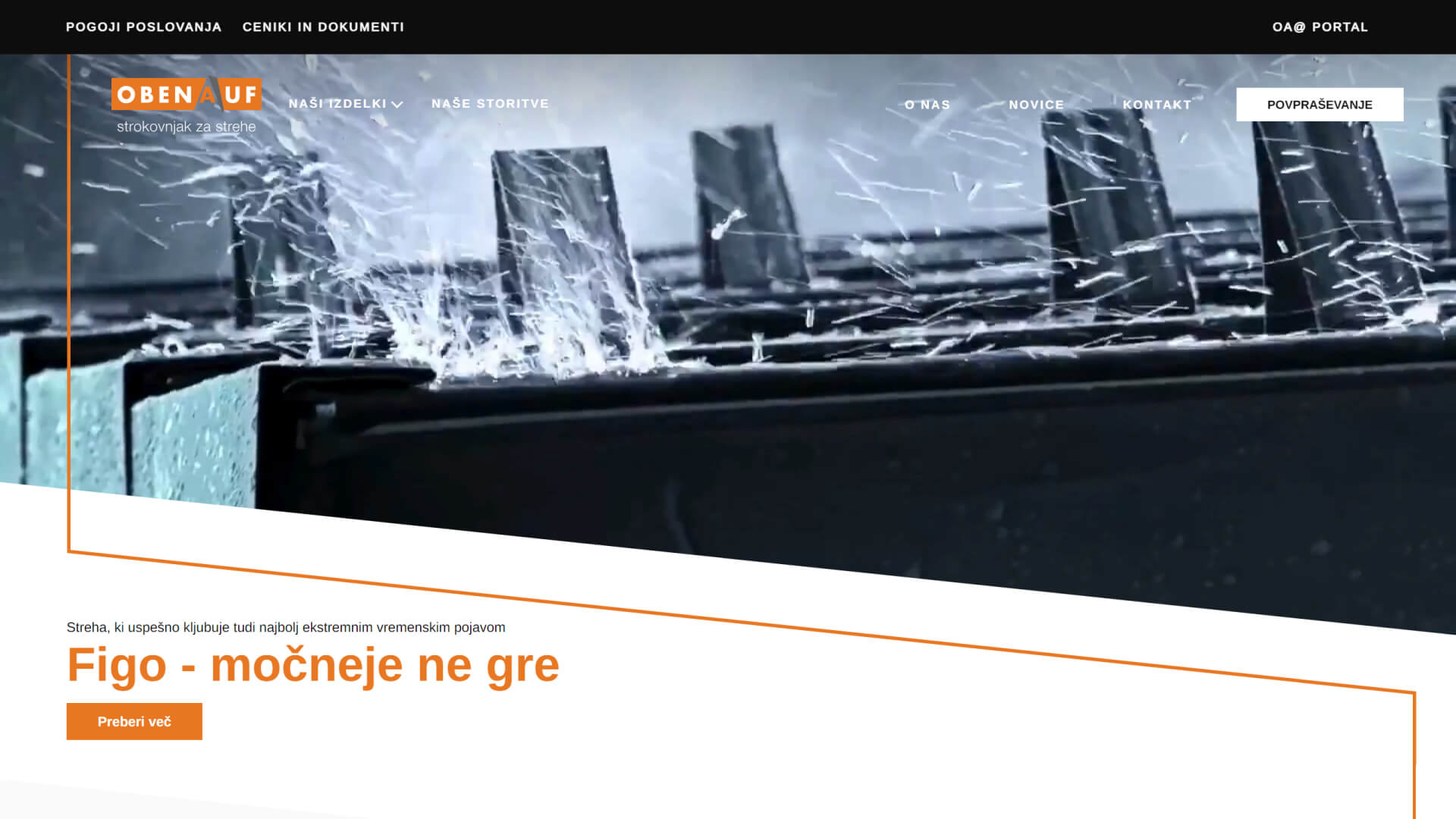
Visitors of the main page are guided through the presentation and the key product and service categories, and invited to become business partners - thus gaining access to the business portal and additional business benefits such as seminars, lectures, etc.
The client wished to incorporate the orange line (which is one of the more distinctive elements of their printed materials in the client's distinctive orange colour). I animated it and used it as a trigger to guide the visitor’s eye and explore the site, rather than a purely aesthetic element.
As a UX/UI designer, I wrote the design brief, then by using competition and best practice research, wireframes and prototypes, came up with the final design. In doing so, it was necessary to critically evaluate ones assumptions at several points and come up with appropriate solutions. Throughout the planning and design phases, I also worked closely with the front-end team to ensure a consistent implementation of the design and adjusted the various elements accordingly.